Now that you have your 3 images at +2 / 0 / -2 on the computer, you're ready to bring them into Photomatix for processing. I hope that you took the time to look at the Photomatix website for their tutorials. If not, click
here and take a quick tour. They explain their product in great detail with some very fine illustrations. If you care to go further, they also have some good videos.
Photomatix shows how to load the images to be processed in step 2 of their tutorial. In the next step there are some choices.
With the
"Generate HDR - Options" dialog box open, this is what I recommend.
Align source images - I have that box checked. It doesn't hurt to do that, even if you used a tripod.
I do not check "
Reduce chromatic aberration, Reduce noise and Attempt to reduce ghosting artifacts." These corrections can be made in Photoshop later if there's a problem.
I click
"Generate HDR" and Photomatix will merge the 3 pictures into a single HDR image.
Don't get scared when you look at the screen when Photomatix is finished. What you are seeing is a 32bit/channel image that your screen
can't handle. The next step is where the fun starts.
Tone Mapping converts the 32bit/channel into a 16bit/channel TIFF or JPEG image that the screen
can handle. At the bottom of the dialog box, I click
"Tone Mapping". That brings up a dialog box with a lot of sliders. I'm only going to use a few of these to start. Once
you get the hang of all the previous steps and process multiple images, you may want to experiment with the others. I don't bother with them at all. I'll show you my settings below, but first, a major point. Every image will be different. These setting will work fine as a starting point, but over time
you will find the ones
you like. Personally, I don't like the
over-the-top HDR images. My settings will reflect that bias, however I invite you to experiment and find what works best for you.
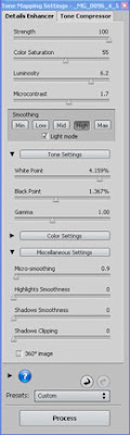
This is the dialog box you will see. Start at the top and work your way down. We'll be using the
"Details Enhancer" process, so make sure that's on. Please pay attention to the histogram and the preview image. The preview image will give a general idea of what the final processed picture will look like, but remember this is only an approximation. The histogram is important. Try to get as much information as possible centered in the box, with little or no highlight or shadow clipping.
Strength: I leave this at 100.
Color Saturation: I like to do my color enhancing in Photoshop where there is more control, so I stay in the 50%-60% range. Move the slider back and forth to see what looks best.
Luminosity: This controls the brightness of the image. Moving the slider to the left makes it darker and to the right to makes it lighter. This can be modified in Photoshop later, so don't worry about it at this point and experiment to find the settings that suit you.
Microcontrast: This slider increases or decreases detail. I keep my slider between 1 and 2. Move the slider back and forth until it looks good to you.
Smoothing: This determines the overall look of the image. The higher the setting the more natural the look. The lower the setting the more unnatural. I keep mine set to High.
White Point and Black Point: I move the sliders back and forth until most of the histogram information is centered.
Gamma: I leave at 1.00.
I don't do anything with the other sliders.
Click Process
Here's an important trick. If you don't like the way the processed image looks and you want to start over and change your settings, just press and hold Control+Z to step back to an earlier screen in Photomatix.
I have talked to other photographers who have tried Photomatix HDR processing and didn't like the results for one reason or another.
THIS IS THE KEY CONCEPT FOR HDR: Processing with Photomatix is only the beginning of the HDR process. The image that comes out of Photomatix usually looks flat and may have other issues. It must be brought into Photoshop for further processing. You can use your normal work flow and/or introduce corrections from plug-ins. You can process it again in Photomatix. There are no hard and fast rules for HDR Processing. Experiment, experiment, experiment. You can always use the "Control + Z" keyboard shortcut to move back one step or the "Control + ALT + Z to move back multiple steps, or just start over.
The first thing I do is take a few minutes to study the image. I learned this trick from Vincent Versace. Maybe it's not a trick but it certainly helps in my work flow. He calls it "Image Mapping". Image Mapping is a process by which he creates a new layer, clicks on the pencil tool, increase the Master Diameter to a good working size and draws out his strategy by making notes on the image. In the beginning it helped me to analyze my images and plan my correction strategy. (See the image below.) Give it a try.
 Now that I'm in Photoshop with my 3 original pictures and my Photomatix processed image, I want to combine them and use the best parts of each. I may need all three of the originals or just one. Most of the time, I use the darkest and the middle exposed pictures. In the following example, I'm only going to use the image where the people are not blurred but the same steps will hold true if you use 2 or 3 images. I always make the big corrections (global corrections) first and then work towards the details, (local corrections). In the example above, I have indicated that I want to replace the blurred figures with those that are in not blurred. Here's how it's done:
I open the Photomatix processed image
Next, I open the original pictures where the people are not blurred and process it in Photoshop to have the same visual qualities as the Photomatix image. It won't be exact but it should be close. I click on the "Move Tool" ("V"), hold down the "shift key", click, drag and drop it over to the Photomatix image. I will now have the 2 images in perfect registration and both layers will be shown in you Layers Palette. I like to name my layers so I'm not confused later. To do this, I put the cursor on the layer name and double click. Type in something like "reduce ghosting".
At this point, we should discuss "Layers" and "Layer Masks". Layers and Layer Masks are the backbone of the final processing of our images. Here and here are additional tutorials for you to see. I strongly suggest you take the time to learn and understand them both. Next I add a "Layer Mask" to the top layer. (click the "add layer mask" icon at the bottom of the layers pallet [the gray square with the white circle]).
Here's another tip from Vincent Versace. He calls it the 80/20 Rule. If you're going to use 80% (+/- ) of the top picture, you'll use a White Mask, revealing the entire top image or, if you're going to use 80% of the bottom picture, you'll use a Black Mask which will hide the top layer completely and reveal the bottom layer. I hope that makes sense but once you try it you will find it easier to understand.
Here's the 20% (+/-) part. If I have applied a white mask I do the following:
I make sure that the Foreground and Background colors are at their default setting by pressing the "D" key. I have the Foreground color set to Black. I can switch the Foreground and Background colors by pressing the "X" key.
I click on the Brush Tool ("B") and check to see that the Opacity is set to 100%. I use a soft brush in a size required to accomplish the task at hand and change the size by using the right and left bracket keys as needed.
I make sure that the Layer Mask is active in the Layer Panel by clicking on it. I paint over the areas of the Lower Layer that I want to reveal. I don't worry if I make a mistake. If I do, I can switch the foreground color to White by pressing the "X" key again and paint over the area I want to fix with a White brush.
If I applied a Black Mask revealing the entire bottom layer, I would set my Foreground color to White and paint with a White brush and make corrections with a black brush.
When I have completed the work with these layers, I "Merge Down" by pressing and holding the Control Key + E. If I then want to introduce parts of another Original Picture, I do the same steps over again, using another image.
At this point I use my noiseware filter. I have found that Imaginomics Noiseware Pro works great using just the default settings. If I want to introduce some noise, I use the Opacity slider.
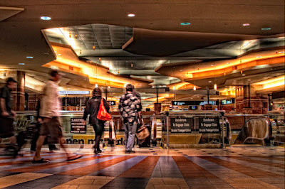
I given you a lot of information. Practice the above steps. Don't be afraid to experiment and make mistakes. In Part 3, I'll discuss some addition tricks and suggestions to help complete the process.If you have any questions, please email me at
akesselhaut@hotmail.com